Typography
“The typeface is itself only a potential, a silent energy, like an actor waiting for a role to play. In order to see a typeface, we must see it perform as part of a story, a monument, a manifesto…”—Sumner Stone
Using type effectively requires sensitivity to the typographical nuances of size, leading (line spacing), word and letter spacing, hyphenation, justification, etc. In addition, the demands of print differ dramatically from those for the web. I have an extensive knowledge and understanding of these essentials and differences, and know how to utilize them to best advantage.
Typography is a particular passion of mine. During my design career, I have amassed a collection of over a thousand fonts, and that collection continues to grow.
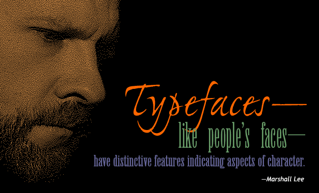
I see myself as something of a matchmaker. Every typeface has a distinctive personality, an aura, almost a scent. It is essential to get in touch with the character of each design project and select the fonts which best express and compliment that character.